Queen City Inn: Spearfish, SD

Overview // Visual Guide, Logo
Role: Primary Designer
Team: Bighorn Design, Queen’s City Inn Owners
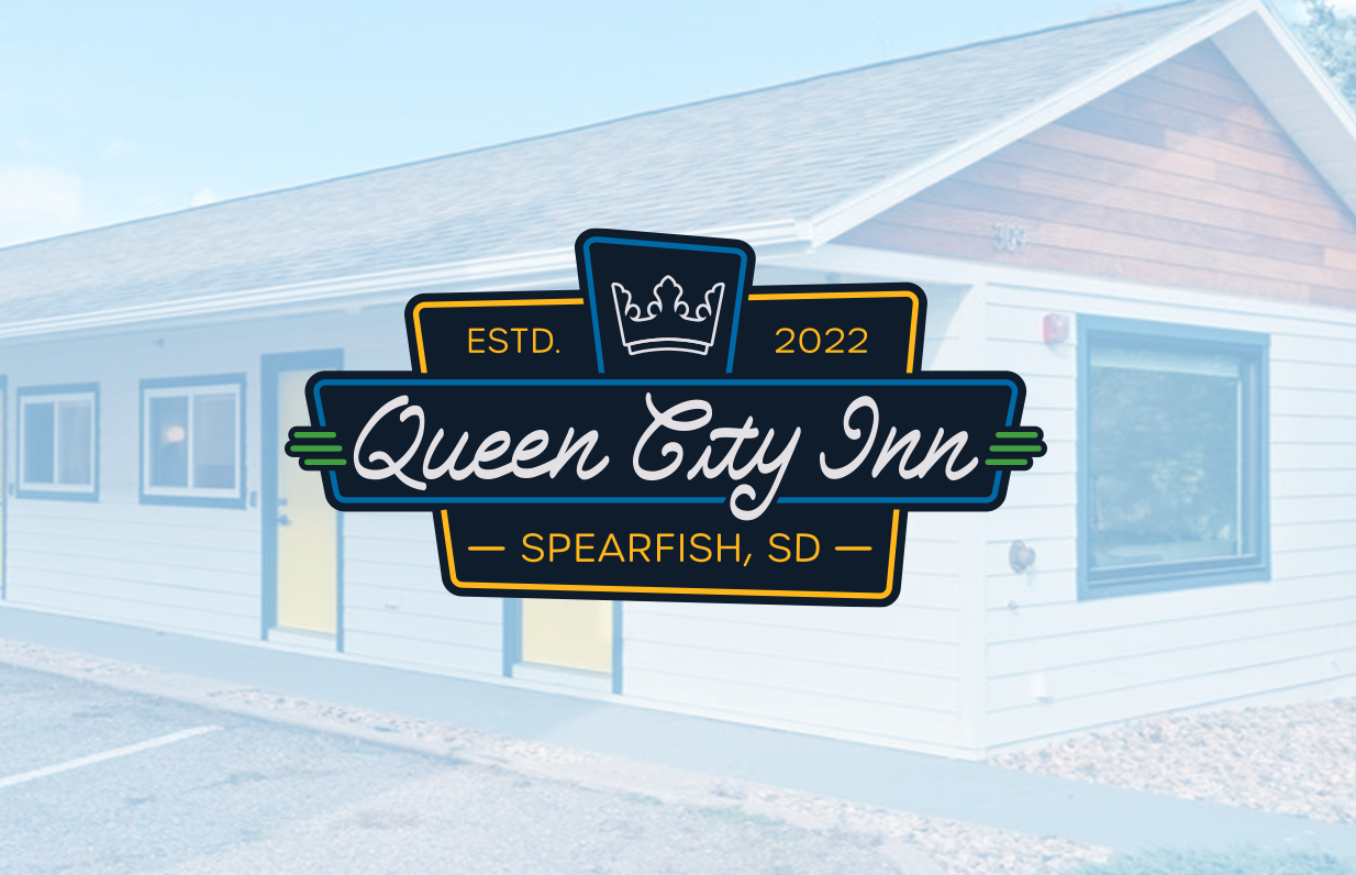
Queen's City Inn, a downtown Spearfish, SD hotel, needed a rebrand that felt fresh yet nostalgic. The solution channeled late-'50s/early-'60s neon-sign energy into a modern identity with an iconic logomark, timeless type, and a palette pulled from the renovation: bold blue and yellow.
I built a scalable system including logo suite, color palette, typography, icon set, secondary marks, and visual guidance documentation to roll out across merchandise, packaging, and exterior signage. The result is a cohesive, playful-but-professional brand that elevates market visibility, reframes the property from "tired" to "reliable and fun," and speaks directly to destination travelers exploring downtown.

Complete visual identity system with logo standards, typography, color palettes, and application examples ensuring consistent brand execution across all digital and print touchpoints.

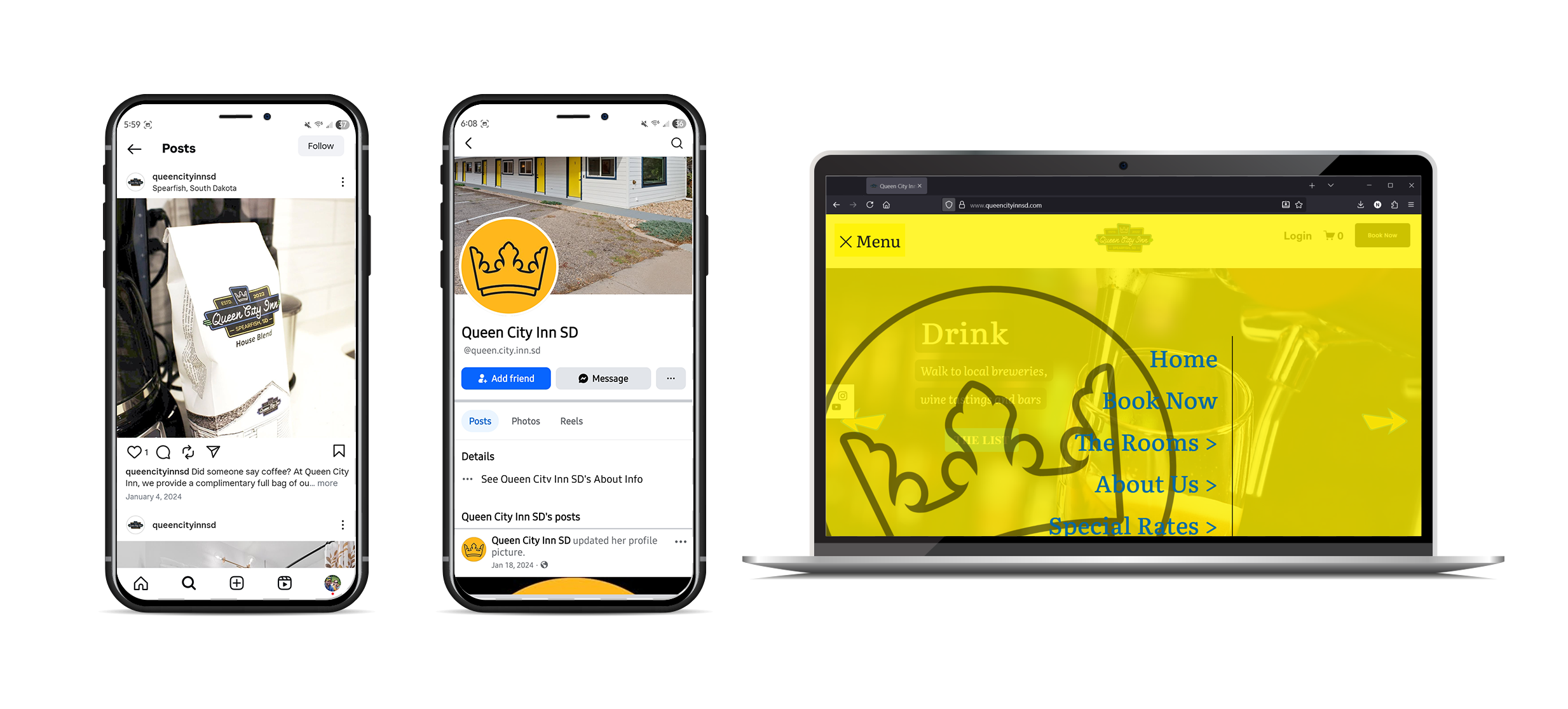
These images showcase Queen City Inn using the visual guide to create a strong, consistent digital presence across social media and their website.